The report about the blog is almost done, but cannot be finished without our last post...so here it is! But before thanking everyone :) we want to draw the attention for a moment to our 'process report paragraph'. This paragraph can be found in the last added page PROCESS REPORT PARAGRAPH and gives you an idea of how our design process developed. It discusses the ways the theory of visual perception is applied, our concepts and the choices we have made that led to the final designs.
Then we really arrived at the end of this final post..Group O and H thank you for your input and comments, to the other groups we hope you all did a good project and to everyone else we hope you have enjoyed reading our blog!
vrijdag 8 april 2011
woensdag 6 april 2011
ASS. 2 | PRESENTATIONS FINISHED...AND NOW?
After the presentations given yesterday, we are now in the part of the process that is about finalizing and completing the work we have done. Deliverables that belong to this part are a report about our blog and a 'process report paragraph' that should be posted on the blog at the latest Friday. These and upcoming days we will work on these deliverables, to eventually complete this project.
dinsdag 5 april 2011
ASS. 2 | FINALLY THE FINAL DESIGNS...
At last the final designs have been developed and can be seen in the fourth added page FINAL DESIGNS ASS. 2. The selfrunning movie, representing the final presentation can also be found there. So if you are interesting in these end results have a look!
ASS. 2 | ALMOST AT THE FINISH LINE...
After experimenting actually totally new concepts have been made. Two examples are shown below. The visual variables mentioned in the previous post are applied to these concepts. There are however some manipulations applied as well that are not mentioned in the previous post, which are:


- Text direction: the direction of the text goes with the intended direction to walk in.
- The railway station pops out, because of its different size and colour, which should indicate it is the starting point of the route.


'Route K' The Culture route

However, we thought the difference in style between the older versions and these new concepts was too big and the new concepts were not explicitly better in their visual variables. So for the final designs we decided to stick to the old style and improved the older versions with this style.
donderdag 31 maart 2011
ASS. 2 | ON THE WAY TO THE FINAL VERSIONS
With the remarks from the test and the VCD-counseling meeting we experimented a bit. Some of these experimental images are shown below:


The icons are in a perfect circle, yet the tiles on the left seem to be bigger than the ones on the right due to the perspective lines. The gradient provides a contrast difference which makes it look like the tiles spiral into the depth starting at the bottom going clockwise.

As seen/ to be proven: a perfect circle. The tiles have a slight gradient (starting at the bottom, going clockwise) in both highlight/shading and in blur. It is barely noticeable, but gives a slight percetion of depth.

Instead of the perspective lines we chose a picture with perspective as background. Colorized it to yellow as it opposes the blue tiles. The more contrast it has the more likely it is to be seen first. So once again from high to low contrast (clockwise).
ASS. 2 | STILL SOME DIFFICULTIES...
After already quite a long process of improving and improving and improving, we still had some difficulties in finding and designing good maps. Meaning, maps that differ in a very subtle way, but make you without a doubt walk in two different directions. Related to this we still were not really sure whether some manipulations were allowed or not. This together with the fact that the test did not work out that well (not many respondents would walk in the way we wanted them to do) made that we wanted to make use of the VCD-counseling meetings that are offered this week. This was very useful and has put us on the right track again. The remarks we got, may be of use for you as well, so here they are:
- we should not fiddle with the circle too much
- we should influence the user with only the theory of the book of Colin Ware
- keep it simple
- if the different drawings of the buildings distract too much, make them more alike
- give buildings sort of the same spacing
- the train station cannot semi overlap the circle, this would be too obvious
- in the future let girls interview, they are more likely to be helped
- be as creative as possible!
ASS. 2 | IN THE MEANTIME...
Because a selfrunning movie will be the means to present our design process and final designs, we thought of the set up of the video in the meantime. In the images below you see a general set up in parts and a more detailed scenario of what should be discussed in every part.
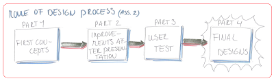


- Part 1: in this part the emphasis will be on the first concepts, presented during the first presentations. Every visual variable we included in these concepts to influence the way of walking will be shown in a close up.
- Part 2: in the second part the emphasis is on the improvements, we had to make resulting from the presentations.
- Part 3: this part emphasizes on the user test. The improved concepts, with which the user test has been conducted, will be shown. After that some pictures of the research itself in Rotterdam will be presented, followed by some results and comments of the respondents. And maybe at last, a summary of the improvements to be made, will be shown.
- Part 4: In this part the final designs will be shown and close ups of the improvements that have been made. To end, the concepts, used for the test, as well as the final designs will be shown together, to give better insight in the improvement we hopefully made.
Abonneren op:
Posts (Atom)